 Skip to content

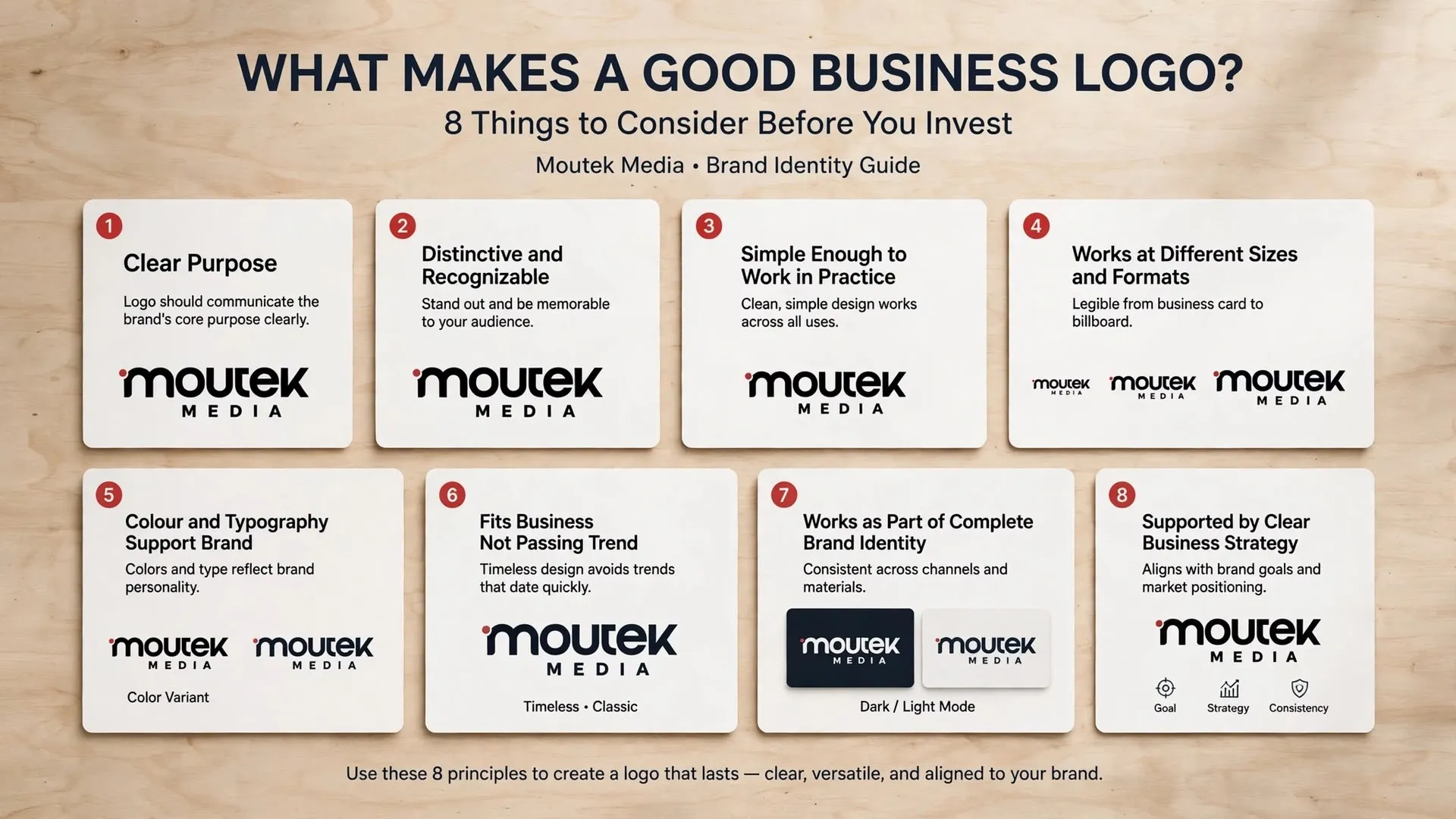
What Makes a Good Business Logo? 8 Things to Consider Before You Invest
A business logo can be attractive, professionally executed, and visually impressive without being the right logo for the company. It might look excellent on a large screen but become difficult to read on a mobile device. It might follow current design trends but resemble dozens of competitors. It might even look exactly as the owner imagined while failing to communicate anything meaningful to the intended audience.
These problems arise when logo design is treated primarily as an exercise in appearance.
A good logo needs to do a practical job. It should identify the business, help distinguish it from alternatives, and work reliably wherever customers encounter it. Its design should also make sense within the wider brand identity and the company’s position in the market.
If you are preparing to invest in professional logo design, understanding the qualities of an effective logo will help you evaluate concepts more confidently and make a better long-term decision.
1. A Good Logo Has a Clear Purpose
Before considering shapes, colours, or typography, it is worth asking what the logo needs to communicate and where it will be used.
A logo for a technology consultancy may need to convey precision, expertise, and clarity. A food brand might need a more expressive identity that reflects its product and audience. A business serving several industries may require an approach that communicates its value without making it appear limited to one narrow category.
There is no universal style that works for every business. The right solution depends on the company’s objectives, audience, competitive environment, and intended positioning.
This is why a professional logo design process should begin with discovery and strategic thinking. Understanding the business first gives the designer a reason for making particular creative decisions. Without that foundation, the process can become a matter of personal taste rather than a purposeful design exercise.
2. It Is Distinctive and Recognizable
A logo should help people identify a business rather than confuse it with another company.
This requires more than choosing a symbol that looks attractive. Designers need to consider the visual conventions used within the industry, examine competing brands, and identify opportunities to create a more distinctive mark.
For example, if every company in a particular sector uses the same familiar icon and colour combination, following that convention may make a new business look appropriate but unremarkable. A stronger approach might retain enough visual clarity to feel relevant while introducing a more ownable form, typographic treatment, or combination of elements.
Distinctiveness should be intentional. A logo does not need to be strange or complicated to stand out, and originality should never come at the expense of legibility. The goal is to create a mark that belongs to the business and can be recognized without unnecessary effort.
3. It Is Simple Enough to Work in Practice
Simplicity is often misunderstood as a requirement to make every logo minimalist. In reality, simplicity is about removing unnecessary complexity so the essential idea remains clear.
A logo may contain a symbol, custom lettering, or several carefully considered elements. What matters is whether those elements contribute to a coherent result and whether the design remains understandable when people encounter it quickly.
Consider how a logo appears in a small social media profile image. Fine details may disappear, narrow gaps may close, and complicated illustrations may become indistinct. A design that depends on details people cannot see is unlikely to perform well in that context.
A good logo balances character with clarity. It should have enough personality to distinguish the business while remaining practical for everyday use.
4. It Works at Different Sizes and in Different Formats
Businesses rarely use their logos in only one place. The same identity may appear on a website header, mobile screen, business card, presentation, advertisement, packaging, signage, or printed document.
Each application creates different technical demands. A detailed mark that works well on a large display may lose its definition when reduced. A design intended only for a light background may become difficult to use on darker surfaces. A logo created in a low-resolution format may look poor when enlarged for print.
These are not minor production details. They affect whether the identity can be used consistently across the business.
Professional logo design should consider scale, contrast, legibility, and file requirements from the beginning. Depending on the project, the final identity may need alternate versions, a simplified symbol, light and dark treatments, and suitable vector and raster formats.
The objective is not to force every logo into an identical arrangement. It is to ensure the identity remains recognizable and usable in the situations that matter to the company.
5. Colour and Typography Support the Brand’s Position
Colour and typography influence how a logo is perceived, but neither should be selected in isolation.
A business may want to communicate confidence, warmth, technical expertise, accessibility, or refinement. Its visual choices should support that intention while remaining appropriate for the audience and industry.
However, colours do not have fixed meanings in every context, and a particular typeface cannot guarantee that a company will appear trustworthy or premium. Perception depends on the combination of visual elements, the surrounding design, cultural context, and the experiences people associate with the business.
The more useful question is whether the selected colours and typography help express the intended brand position and remain functional across relevant applications.
These choices should also work within a broader visual identity. The logo needs to coexist with the typography, colours, imagery, and graphic elements used throughout the company’s website and marketing materials.
6. It Fits the Business Rather Than a Passing Trend
Design trends can be useful sources of inspiration, but they are unreliable foundations for a business identity.
A logo created entirely around a fashionable gradient, typeface, or visual effect may look contemporary today and dated a few years later. Replacing an identity every time the design landscape changes can also create unnecessary expense and weaken recognition.
This does not mean that a logo must be timeless in the sense of never changing. Businesses evolve, audiences change, and identities sometimes need refinement. The point is that a logo should be built around the company’s identity and objectives rather than borrowed wholesale from whatever happens to be popular.
A considered design can feel current without depending on a temporary visual trend. Its strongest qualities should come from its relevance, distinctiveness, and ability to represent the business accurately.
7. It Works as Part of a Complete Brand Identity
A logo identifies the business, but customers experience the brand through many other interactions. They encounter the company’s website, social media content, advertisements, customer service, proposals, products, and communications.
If the logo looks professional but the rest of the presentation feels inconsistent, the overall brand experience may still be weak.
This is why logo design should connect to a broader branding system. Typography, colour, imagery, layout principles, and messaging should work together to create a recognizable presence. The identity should also be supported by guidelines that explain how its elements are used.
A complete system makes it easier for different people to create materials that remain consistent with the brand. It also helps marketing campaigns build recognition over time rather than presenting a different visual personality with every new piece of content.
The logo is an important starting point, but its value grows when it belongs to a coherent and well-managed identity.
8. It Is Supported by a Clear Business Strategy
Perhaps the most important quality of a good logo is that it serves a clear business purpose.
Before approving a design, ask whether it represents the company accurately, suits the intended audience, distinguishes the business from competitors, and can support the company’s direction as it grows.
These questions help separate a design that simply looks appealing from one that is genuinely appropriate. They also make feedback more useful. Instead of saying that one concept feels nicer than another, a business can evaluate which option communicates its intended position more effectively.
This is where experienced designers contribute more than technical execution. They interpret the brief, ask questions, explore alternatives, and use design principles to solve a communication problem. Their job is not simply to reproduce the owner’s first idea, but to help develop a solution that serves the business.
How Much Should You Focus on the Logo Alone?
A logo is a meaningful investment, but it should not be expected to solve every branding problem.
If a business has unclear positioning, inconsistent messaging, an outdated website, or a weak customer experience, a new logo will not automatically correct those issues. It may improve the visual presentation, but the wider business still needs a clear direction and consistent execution.
For some companies, a focused logo project is the right starting point. Others may benefit more from a complete brand identity project that includes strategic development, visual guidelines, and the core assets required for consistent communication.
The best option depends on the company’s needs, budget, and current stage of development. A good design partner should help define the appropriate scope rather than assuming every business needs the same package.
Choose a Logo That Works for Your Business
A good business logo is distinctive, legible, adaptable, and appropriate for the company it represents. More importantly, it is developed with an understanding of the business’s audience, positioning, and long-term objectives.
When these factors guide the design process, the result is more likely to remain useful across different platforms and support a consistent brand identity. The decision becomes less about choosing the most attractive graphic and more about selecting an identifier that genuinely belongs to the business.
At Moutek Media, we combine strategic thinking with creative execution to help businesses develop logos and visual identities that communicate with clarity and purpose. Whether you are launching a new company or updating an established identity, the process should begin with understanding what your business needs its brand to achieve.
Explore our professional logo design services to learn how we approach logo development as part of a wider branding process.
